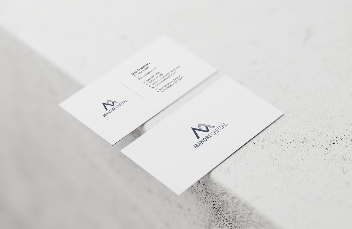
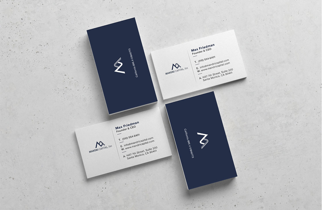
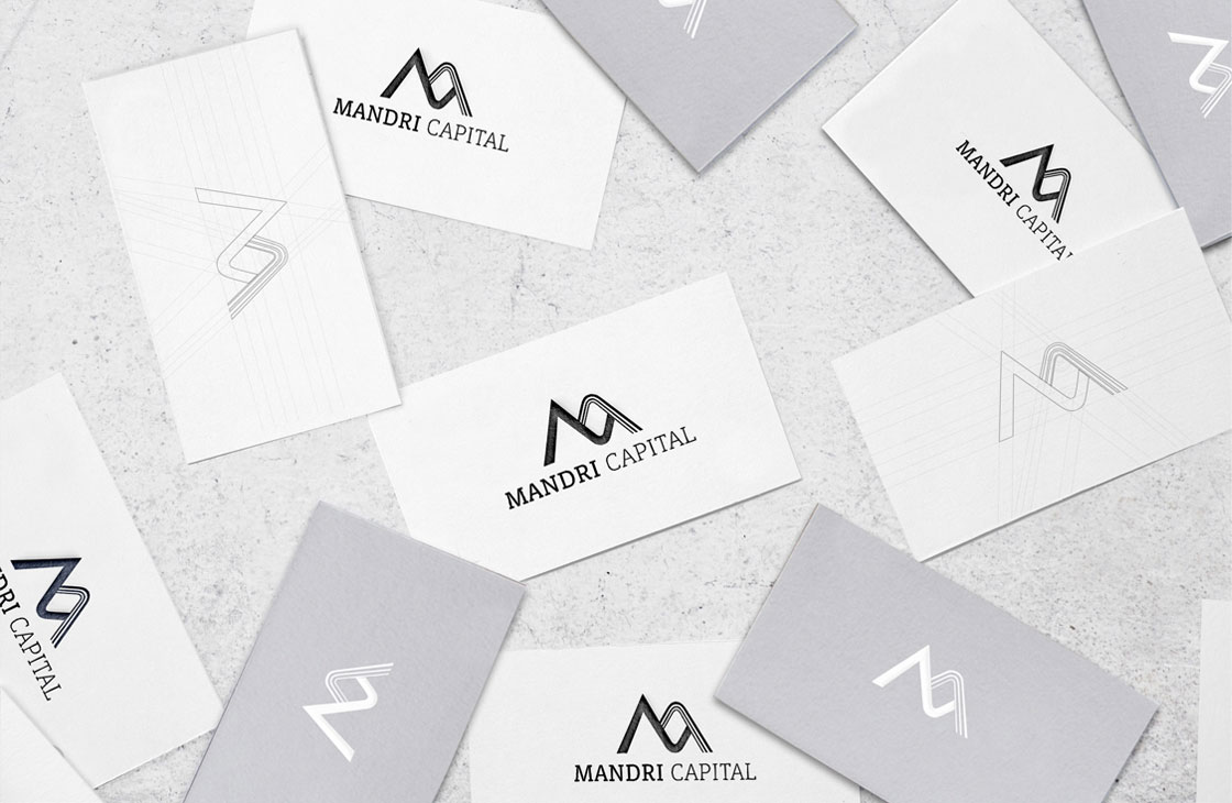
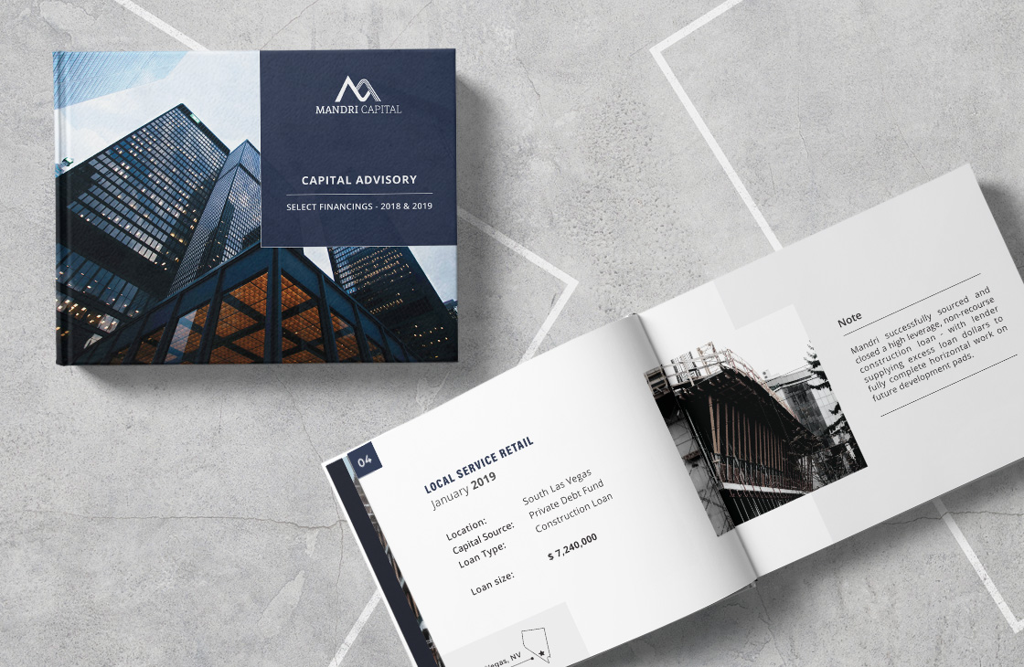
Mandri Capital is a commercial real state firm. The client required a logotype rooted on the iconic architectural features of the city of Barcelona. The logo was inspired on Gaudi’s architectural shapes. The letter M was formed by combining one thick sharp solid line as an expression of robustness and precision with three thin dynamic lines, as an expression of openness and connectivity.